
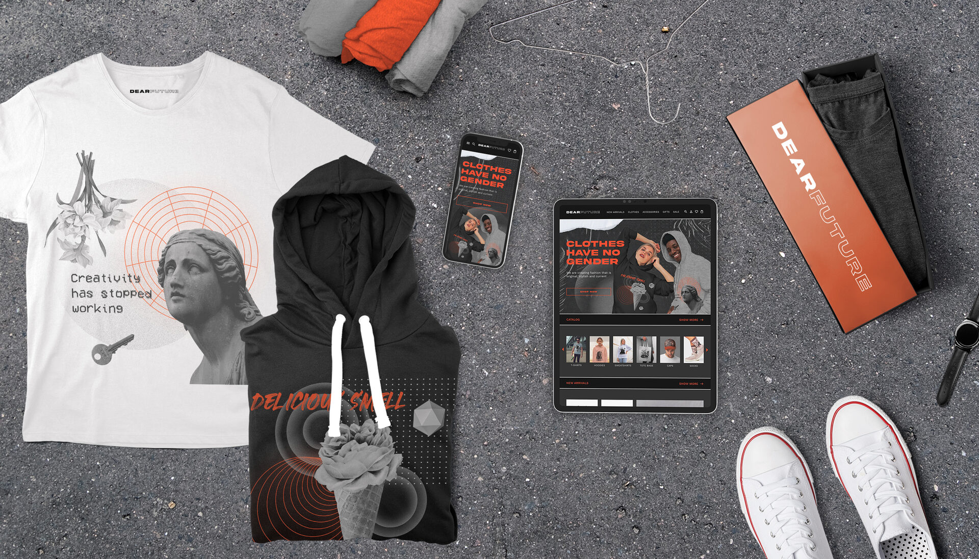
Young brand of gender neutral clothing with personality
Project overview
The product
DEARFUTURE website provides an online marketplace featuring trendy unisex clothing, accessories and gifts. DEARFUTURE uses a modern, extraordinary, and minimalist aesthetic, creating an experience where content and functionality take the forefront of the user experience.
The problem
Available online shopping websites often have cluttered designs, inefficient systems for browsing through products, and confusing checkout processes.
The goal
DEARFUTURE ’s goal is to be user friendly by providing clear navigation and offering a fast checkout process to make shopping fun, fast, and easy for all types of users.
My role
Responsobilities
Duration
UX designer leading a responsive website from conception to delivery
Concept, Research, Visuals, Interactions
2 weeks
(November 2021)
(November 2021)
My role
UX designer leading a responsive website from conception to delivery.
Responsobilities
Concept, Research, Visuals, Interactions.
Duration
2 weeks (November 2021).
Starting the design
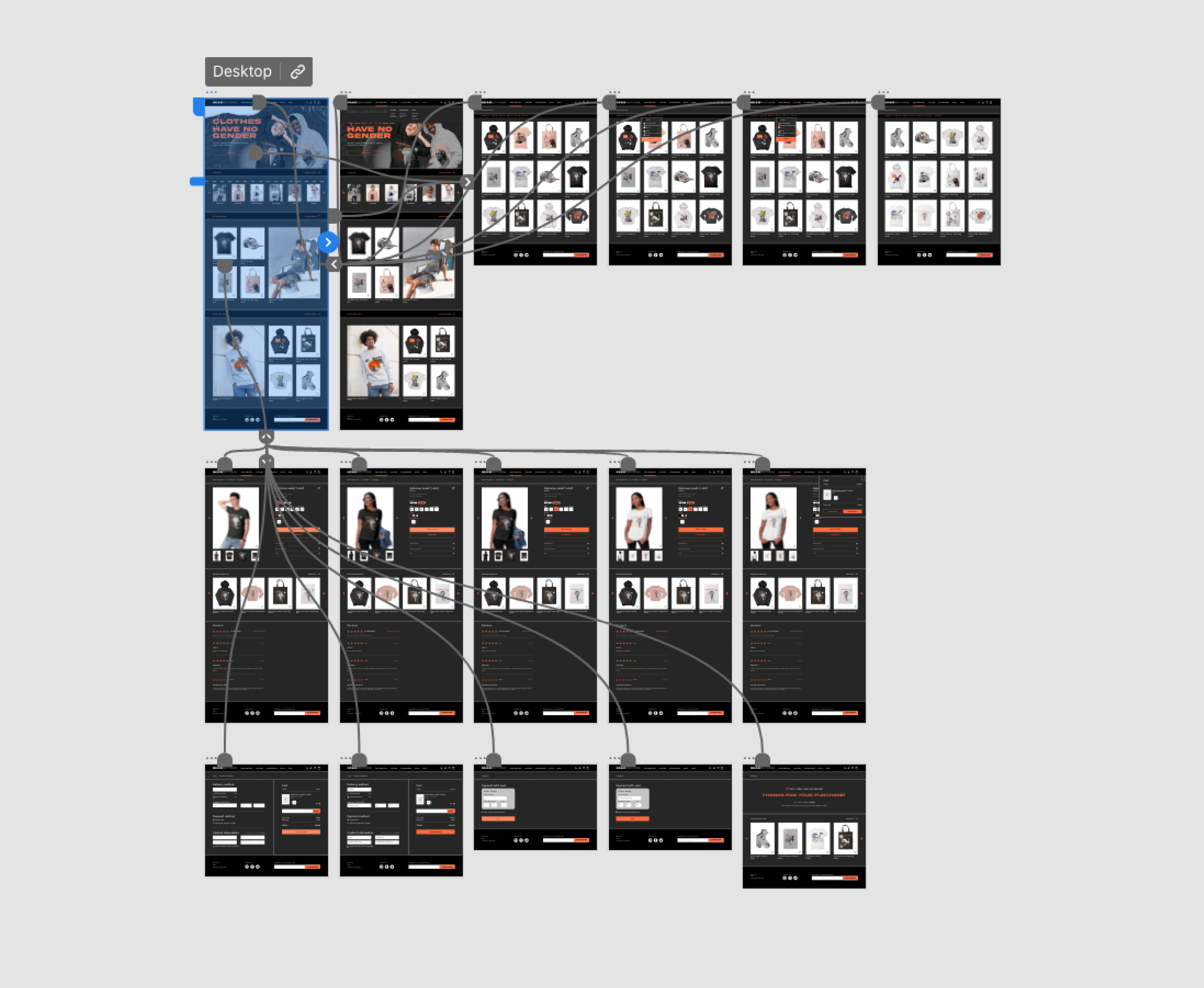
Sitemap
Difficulty with website navigation is a primary pain point for users, so I used that knowledge to create a sitemap.

Wireframing
Paper wireframes
Next, I sketched out paper wireframes for each screen in my site, keeping the user pain points about navigation, browsing, and checkout flow in mind.
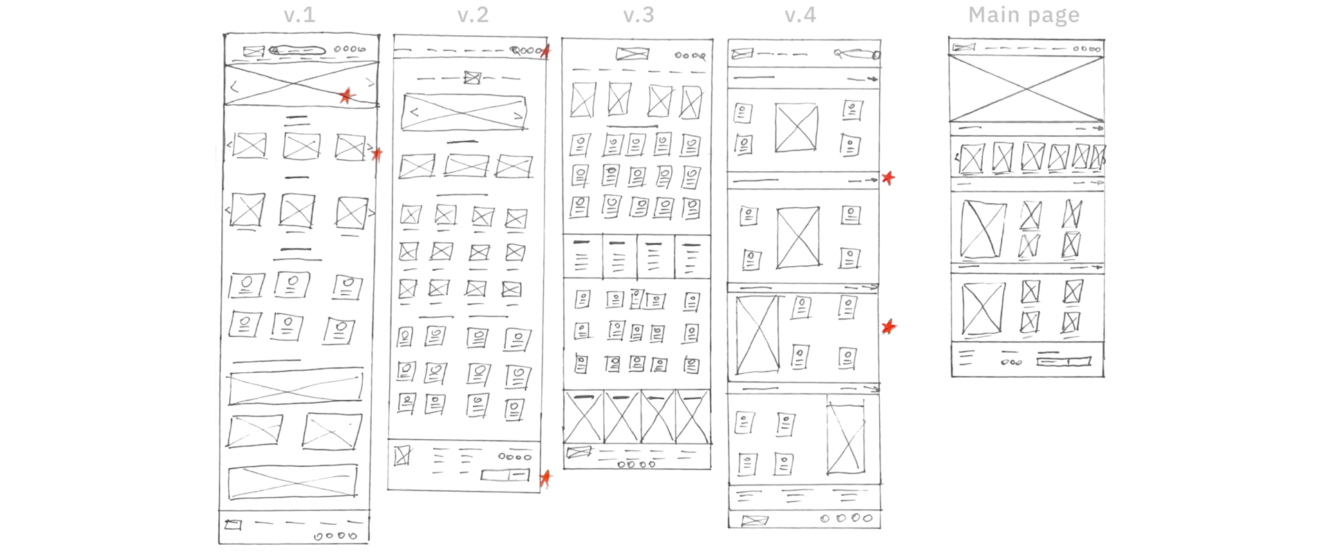
Stars were used to mark the elements of each sketch that would be used in the initial digital wireframes.
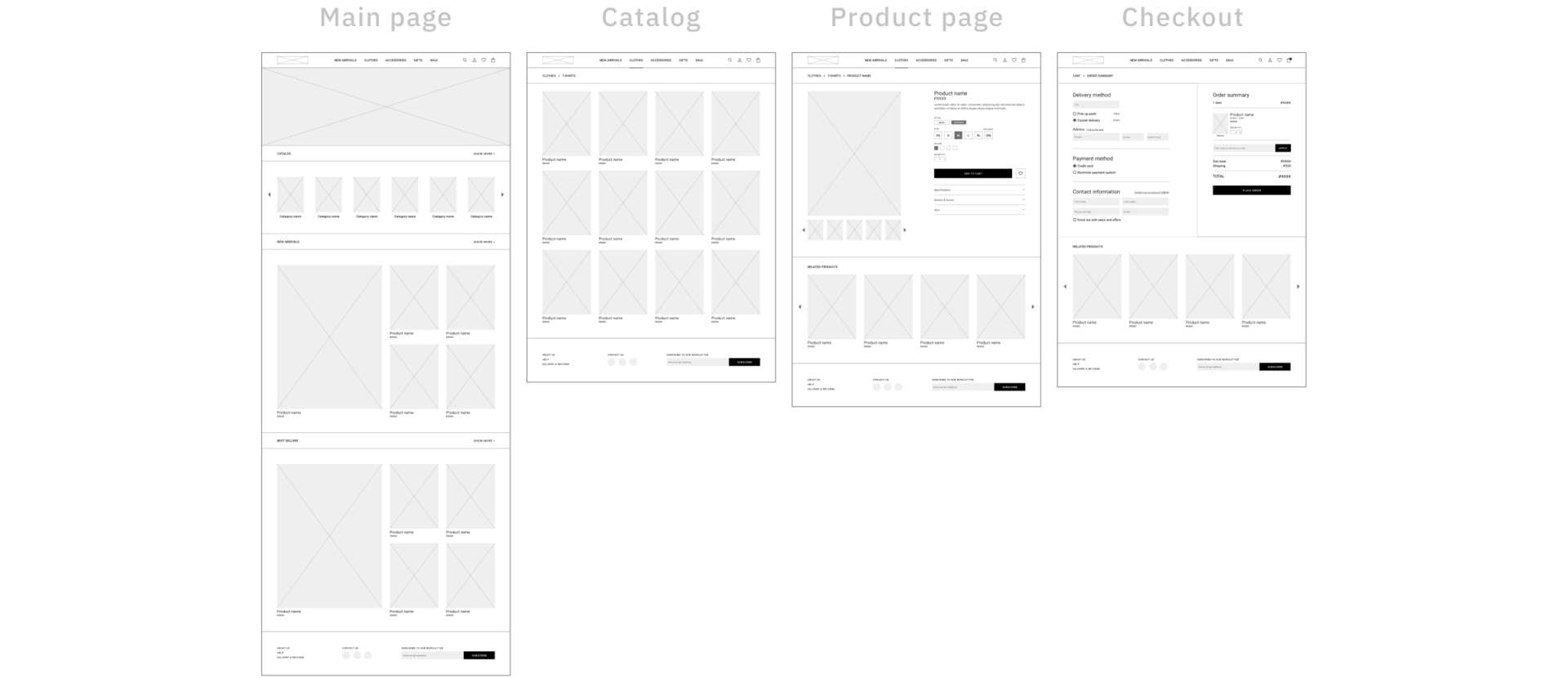
Digital wireframes
Moving from paper to digital wireframes made it easy to understand how design could help address user pain points and improve the user experience.
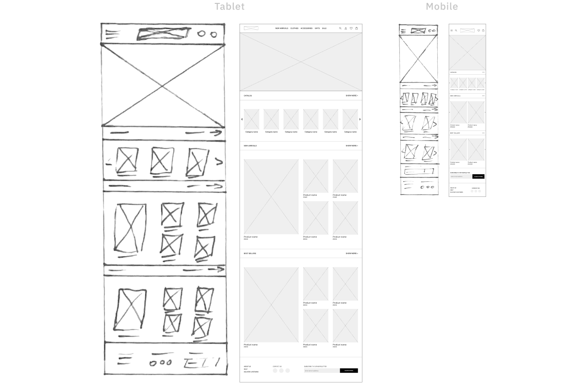
Screen size variations
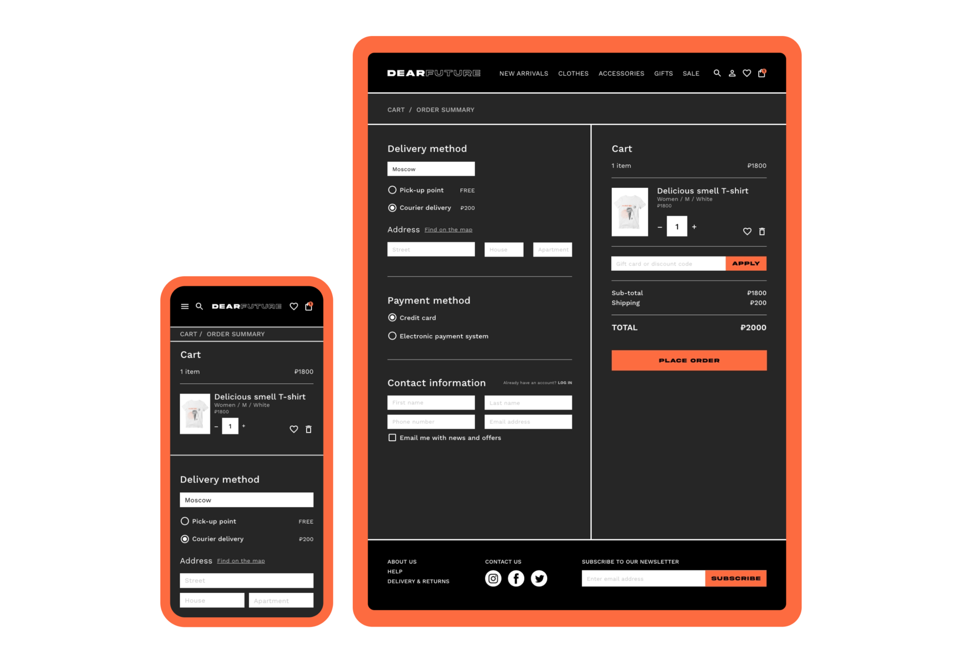
Because DEARFUTURE’ customers access the site on a variety of different devices, I started to work on designs for additional screen sizes to make sure the site would be fully responsive.
Prototyping
The final design
I included considerations for additional screen sizes in my mockups based on my earlier wireframes. Because users shop from a variety of devices, I felt it was important to optimize the browsing experience for a range of device sizes, such as mobile and tablet so users have the smoothest experience possible.
Main page
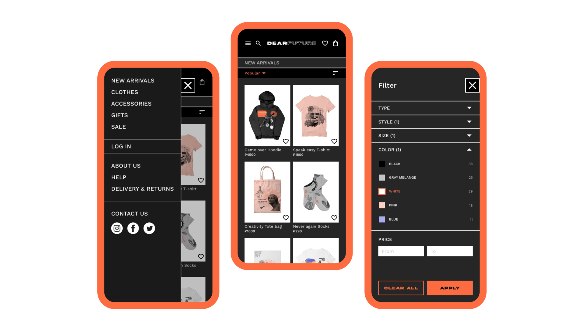
My goal here was to make strategic information architecture decisions that would improve overall website navigation. The structure I chose was designed to make things simple and easy.
The main page focus on optimizing the browsing experience for users. Prioritizing useful button locations and visual element placement on the main page was a key part of my strategy.
The main page focus on optimizing the browsing experience for users. Prioritizing useful button locations and visual element placement on the main page was a key part of my strategy.
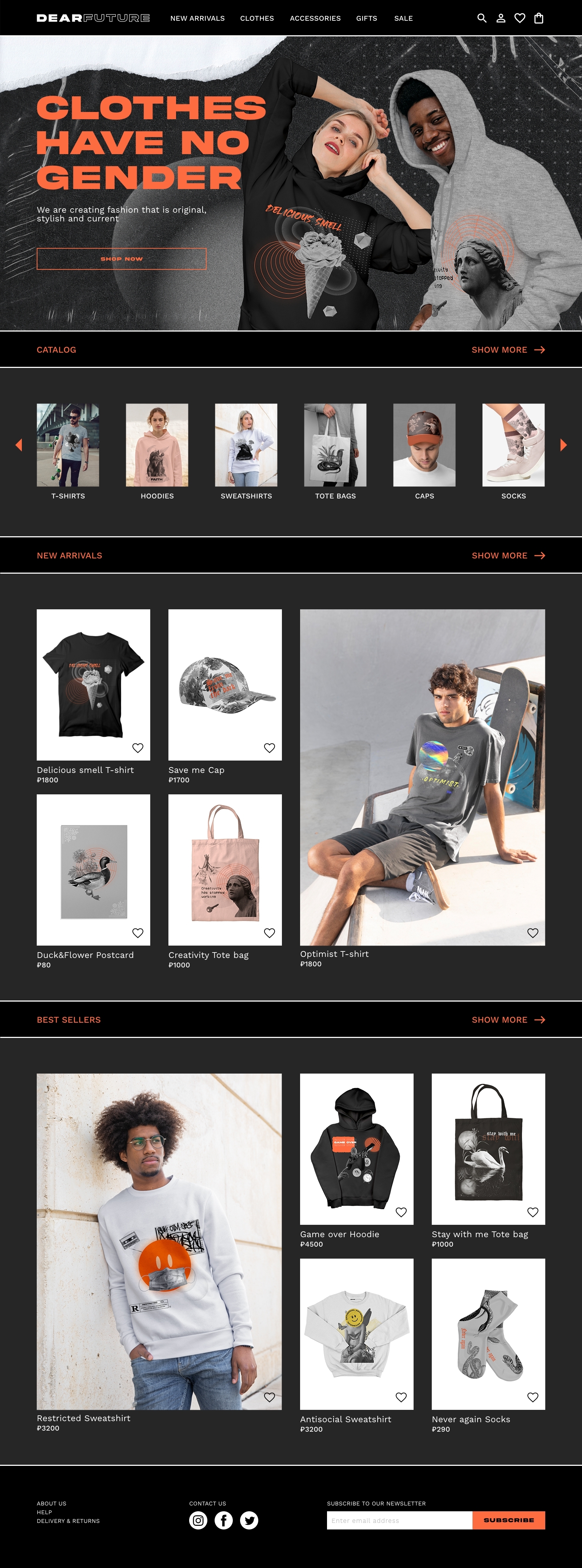
Catalog
DEARFUTURE’s information architecture has a catalog structure. A catalog contains categorized data, with a top level consisting of peers which may contain subordinate items. DEARFUTURE’s top level categories group types of items (clothes, accessorices, gifts, etc), so they can be seen in relation to each other.
Adopting a catalog structure allows users to browse an area of interest, compare items to each other, and view the details of a specific item.
Adopting a catalog structure allows users to browse an area of interest, compare items to each other, and view the details of a specific item.
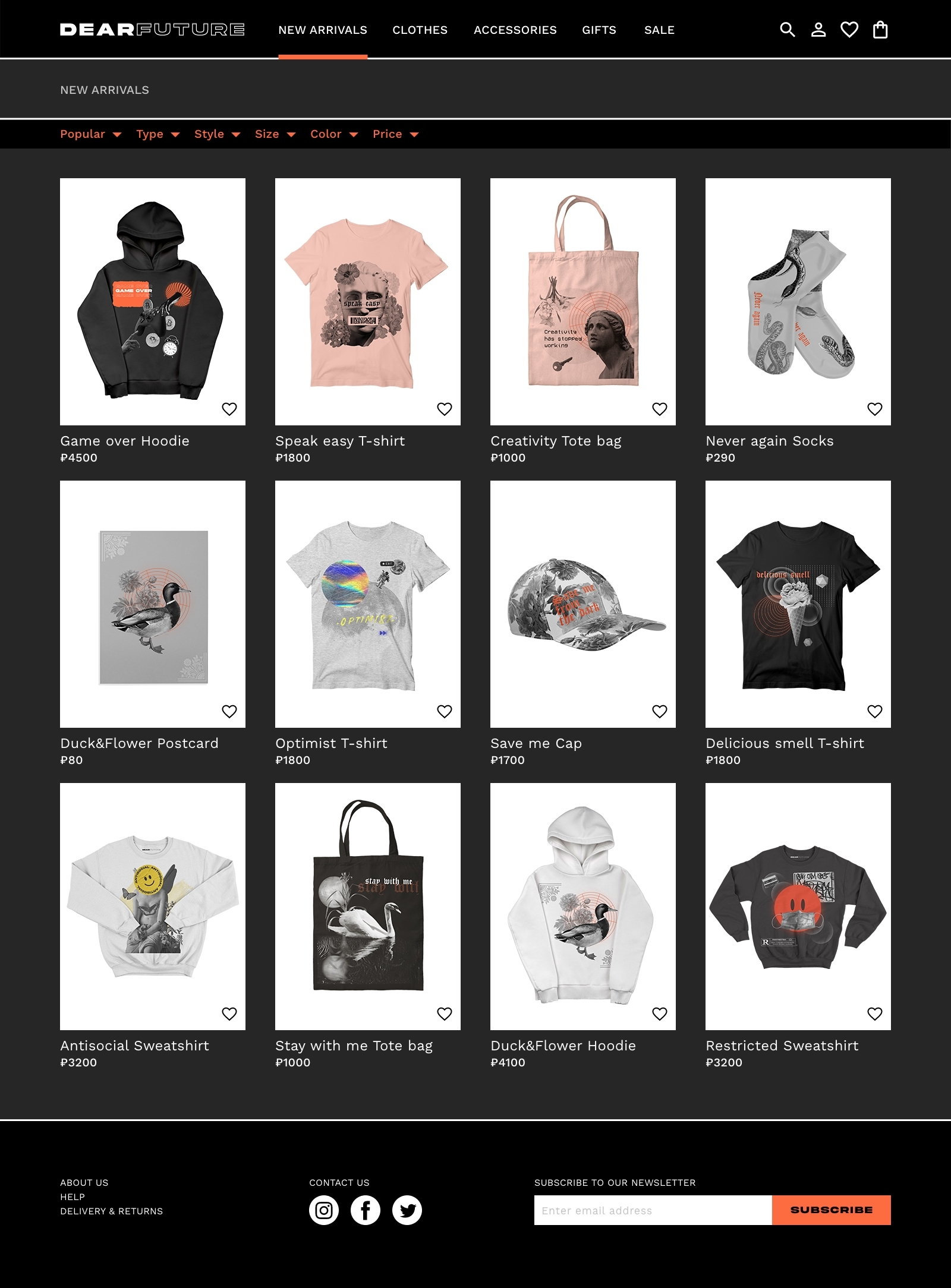
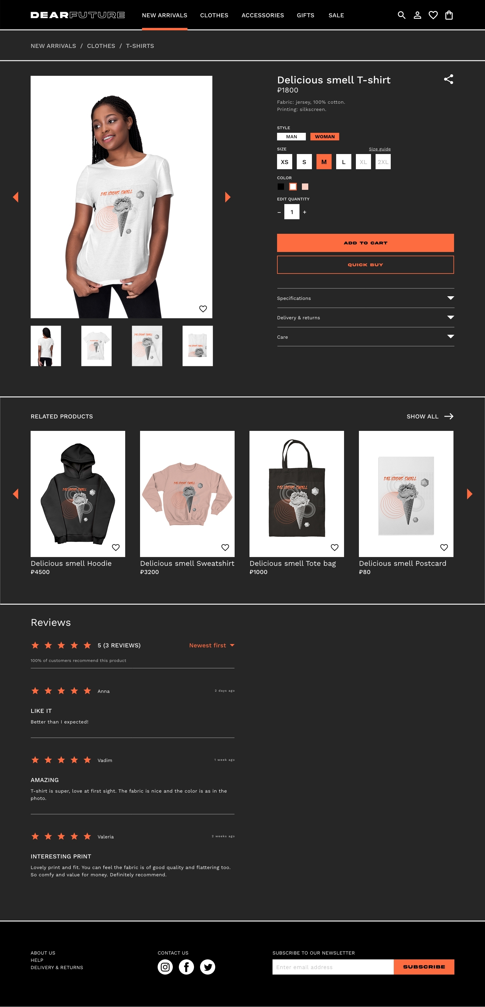
Product page
To help users explore items I developed an individual product page for each item listed on the website. My goal was to design page that will be intuitive to navigate through, more engaging with the images, and demonstrated a clear visual hierarchy. Reviews allow users to make the right decision, and QUICK BUY button offer a fast checkout process.

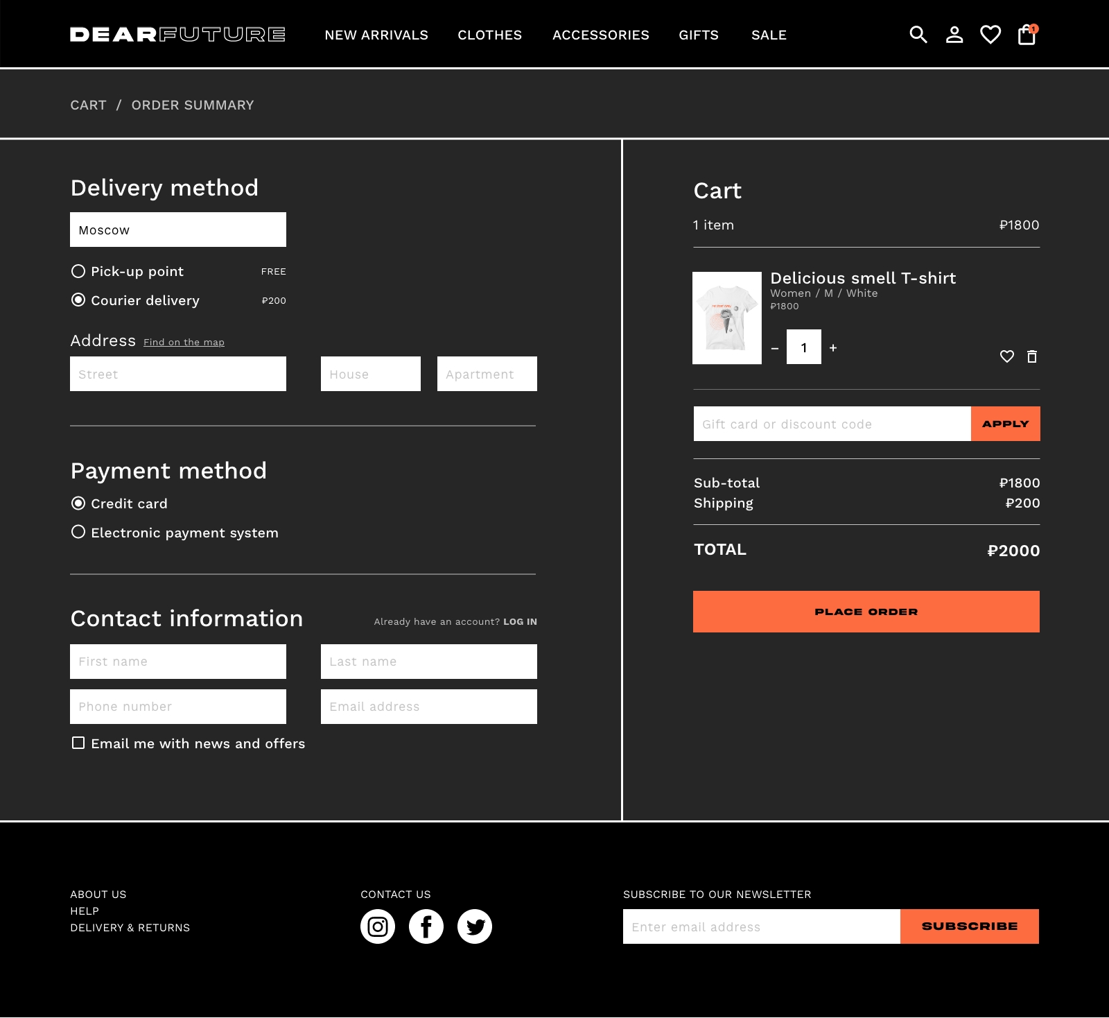
Checkout
To make the checkout flow even easier for users, I had all stages accessible within a single screen, thereby, eliminating redirections to multiple tabs. This design allows for minimal screen usage and a hassle-free, quick and clear checkout.
Style guide
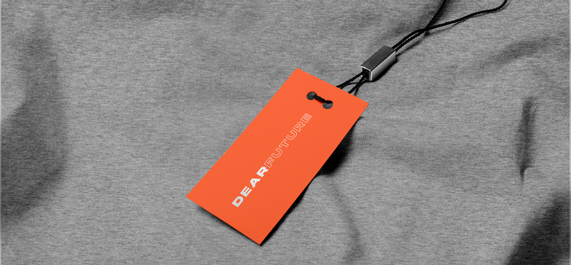
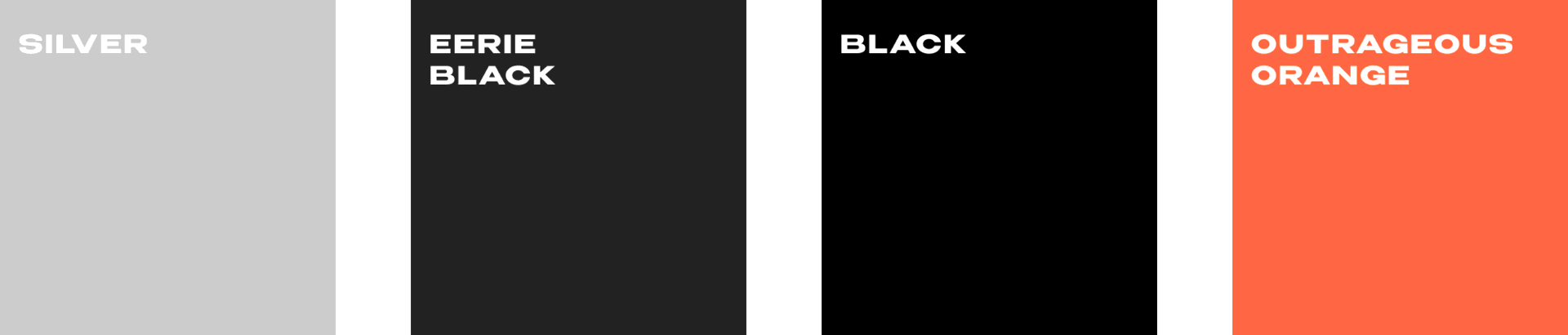
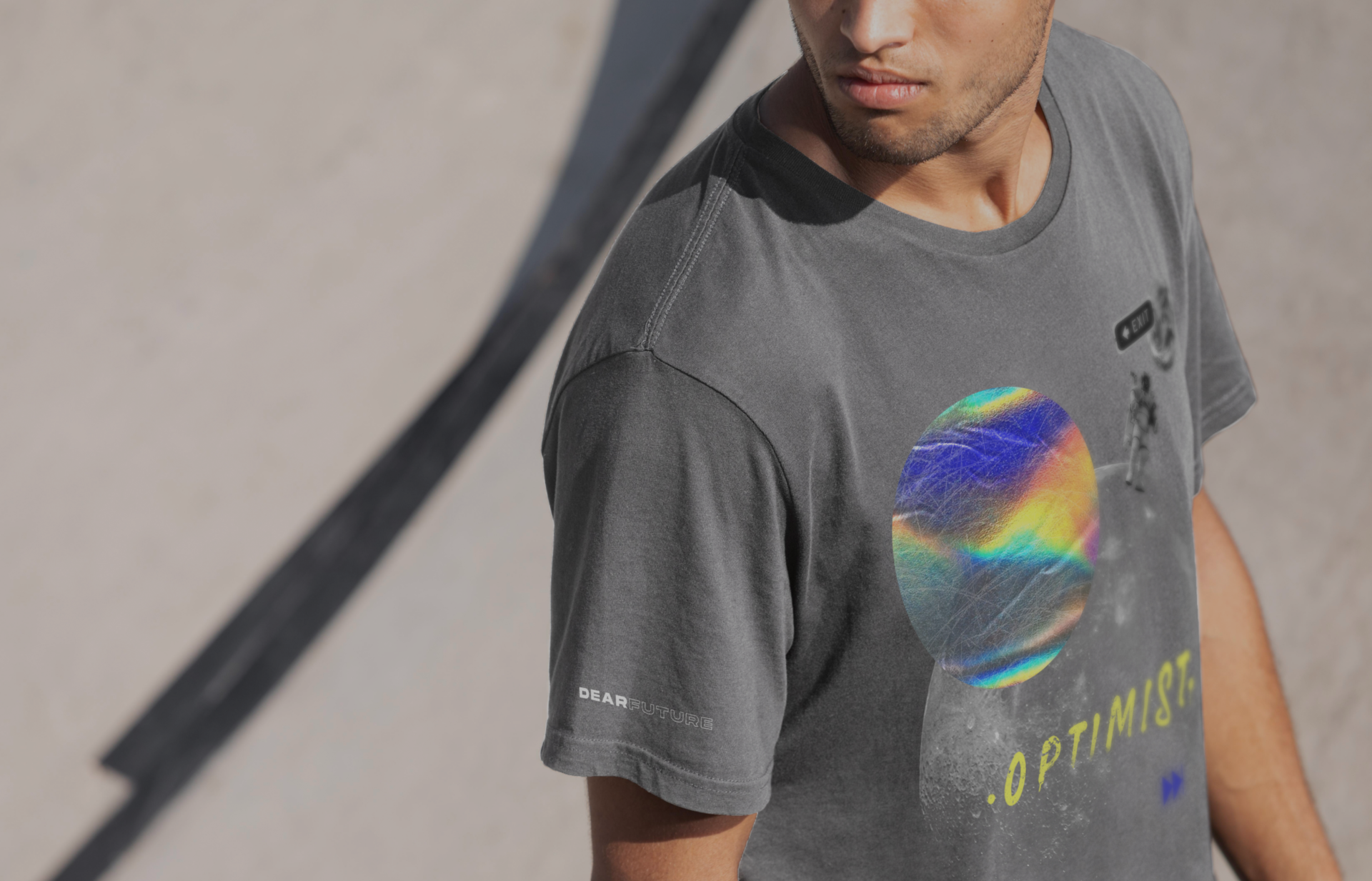
DEARFUTURE’s color theme is primarily monochromatic, using light and dark variations of the black to create an atmosphere of minimalism. I decided to use a dark theme in order to make the design stylish and exceptional. To give emphasis to important design elements, I chose a rich orange color, which creates an emotion of energy and interest.
Logotype
Typography
Headings

Body

Color palette
