An app that helps to give a second life to unnecessary things
Project overview
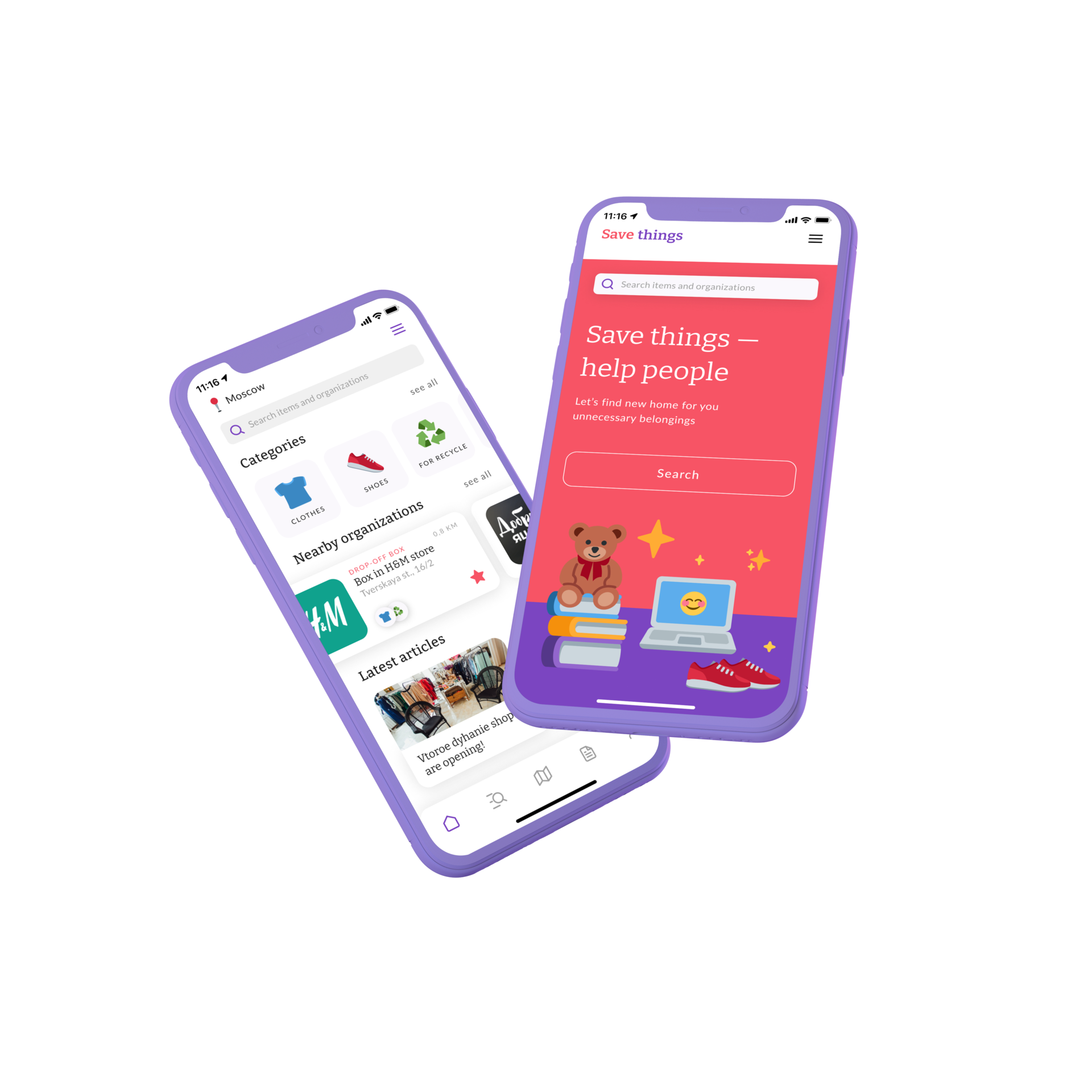
The product
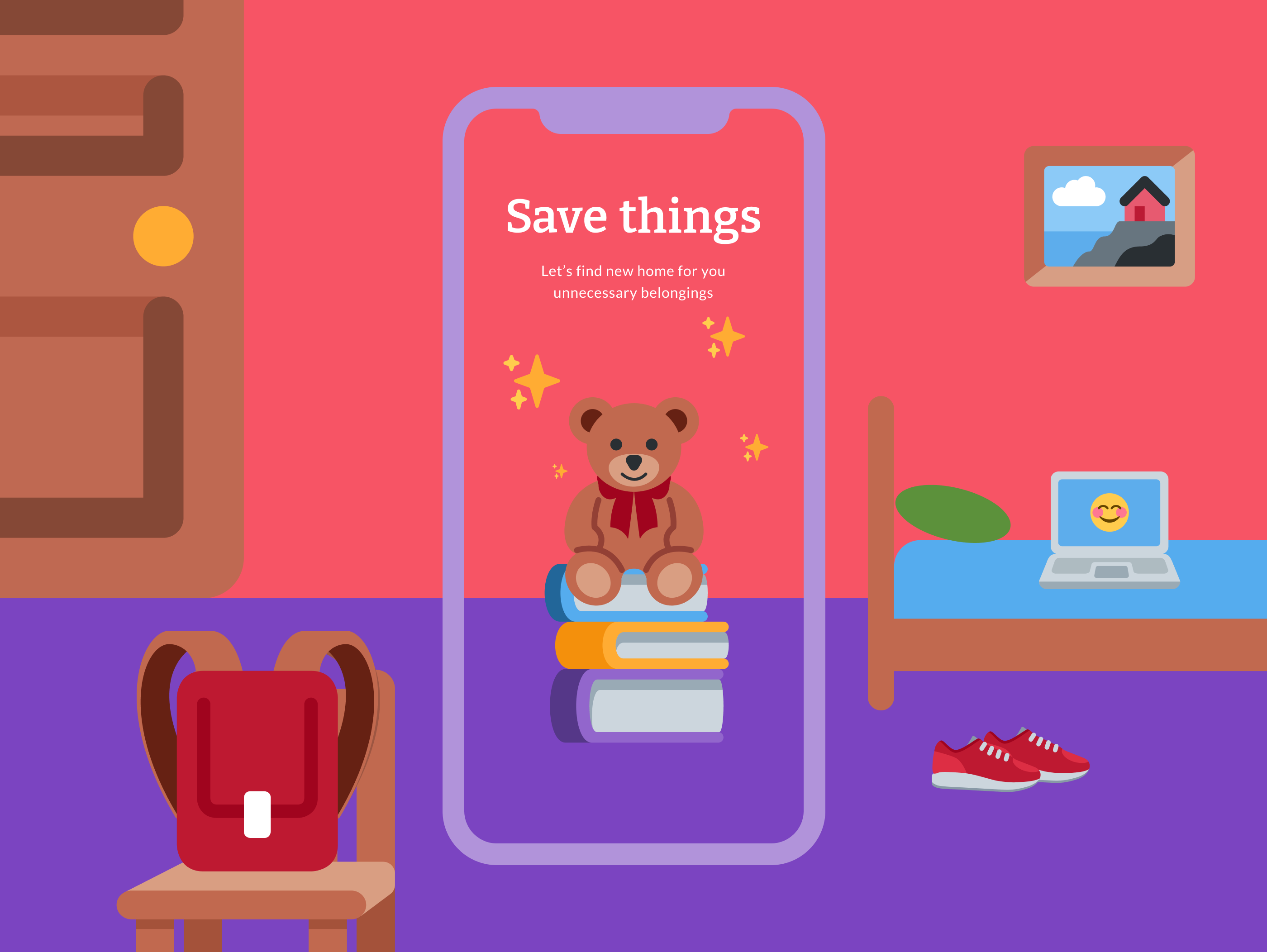
In Russia a new culture of the circulation of things is just being formed. More and more people want to donate things they don't longer need considering social and environmental reasons by helping society and supporting non-profit organizations. Save things is discovery platform that makes it easy to find and explore local organizations that collect things for charity and recycling. In addition, the app provides an opportunity to learn how to manage unnecessary things competently and effectively, so that they don’t become trash and turn into a valuable resource for solving social and environmental causes.
The problem
Before moving, I found that in a couple of years I had accumulated a lot of good things that are no longer used. I started by asking myself, what to do with unnecessary things? I found out that approximately 90% of a personal unwanted belongings goes to the trash because of the absence of a well-functioning recycling system in Russia. I knew for sure that I didn't want my things to end up in a landfill and I started looking for where to give away my stuff. But I couldn't find the service that contains a useful list of all local organizations collecting donations. So I decided to create a platform that helps to give away unnecessary things properly and make them necessary and useful for someone else.
The goal
The main goal is to turn good, but unnecessary things for some people into a useful resource for other people. To do this, I need to create an app that will be both functional (used for finding organizations) and informative (allowing users to check the news of organizations and learn more about charity and responsible consumption).
My role
Responsobilities
Duration
UX designer leading the app and responsive website design from conception to delivery
Concept, Research, Visuals, Interactions
1 month
(December 2021)
(December 2021)
My role
UX designer leading the app and responsive website design from conception to delivery
Responsobilities
Concept, Research, Visuals, Interactions
Duration
1 month (December 2021)
Understanding the user
I conducted user interviews to better understand the users I’m designing for and their needs. A primary user group identified through research was people who get out of belongings they no longer need at least once a year during a cleaning or moving. Some interview participants reported that they they were throwing away things that couldn’t be given away because they don't know what else to do with these things. Participants who donate their belongings to charity admit having difficulty finding local organizations using web mapping platforms.
The feedback received through research made it very clear that users would be open to find more effective way to recycle their unnecessary belongings and willing to reduce the amount of items thrown away if they had access to an easy-to-use tool to help guide them.
The feedback received through research made it very clear that users would be open to find more effective way to recycle their unnecessary belongings and willing to reduce the amount of items thrown away if they had access to an easy-to-use tool to help guide them.
People don’t know how to properly and effectively manage their unwanted belongings
Сartographic services have too confusing categorization that don't match users interests
People are worried about the amount of waste and they feeling badly about some things they throw away
Waste control
Lack of information
Сonfusing search
1
2
3
User pain points
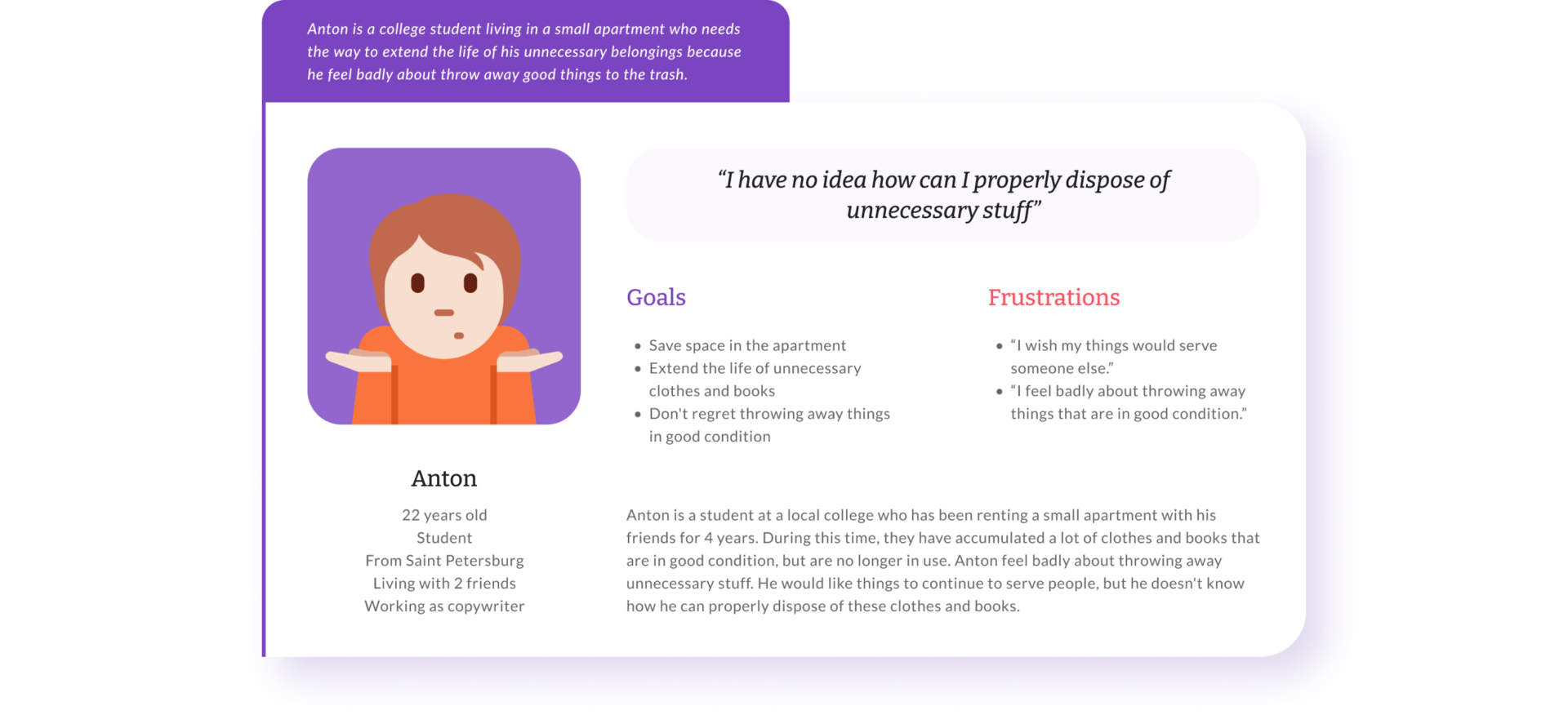
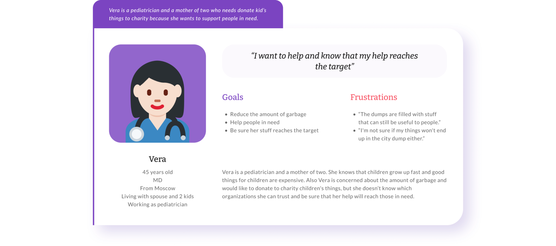
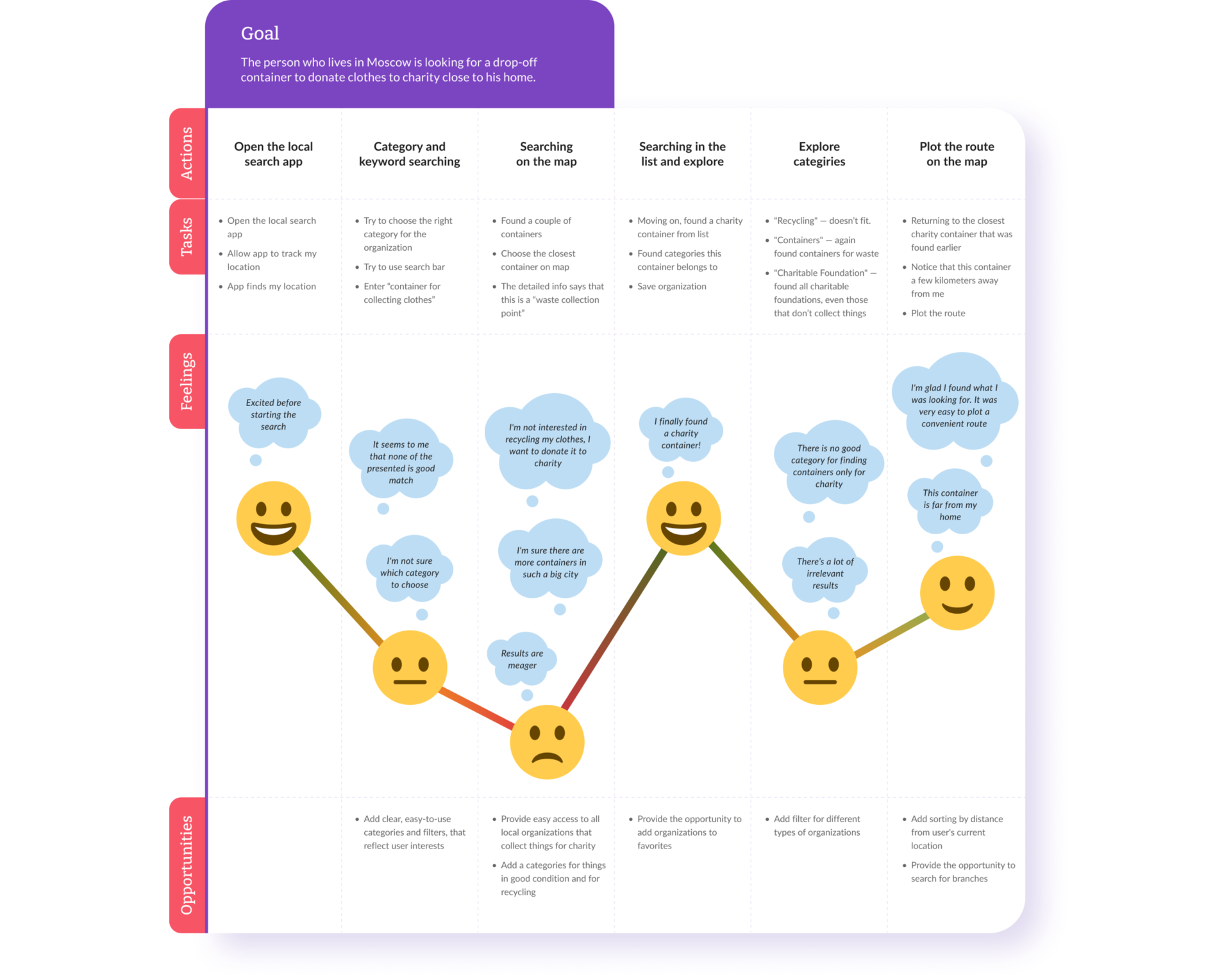
Personas
User journey map
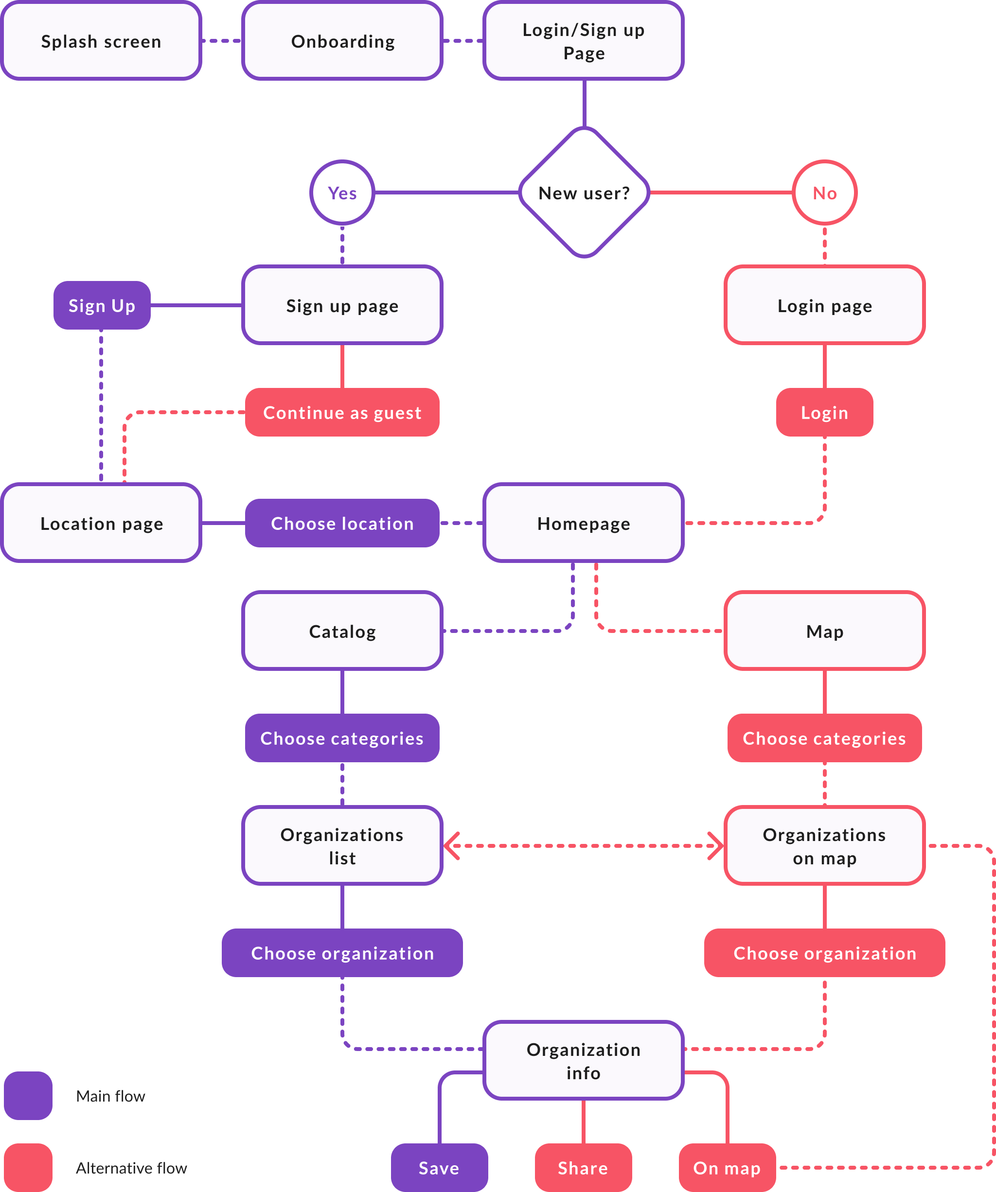
User flow
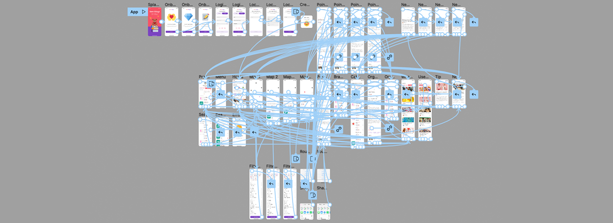
To better understand how I would construct the core experience for Save things, I designed a user flow. This helped me focus more on the experience and needs of the user and less so on the details that I would solidify later on. It also allowed me to communicate the entries and exits more clearly so I would have a better understanding moving forward.
Starting the design
Wireframing
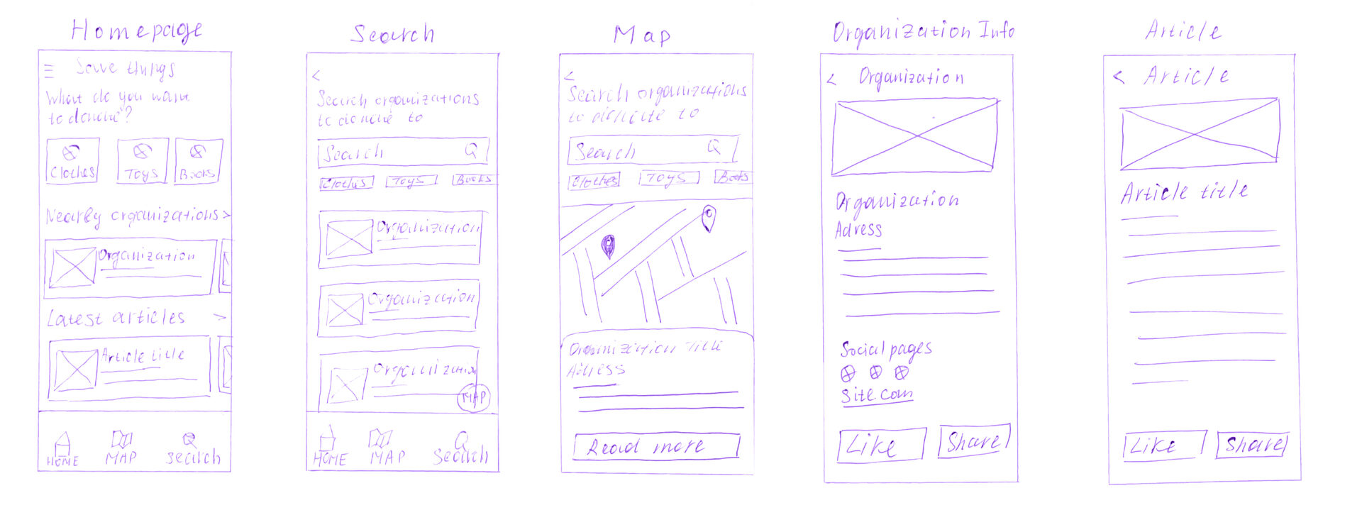
Paper wireframes
After ideating, I sketched out paper wireframes for main screens in my app, keeping the user pain points about confusing categorization and lack of useful information about charity donation in mind.
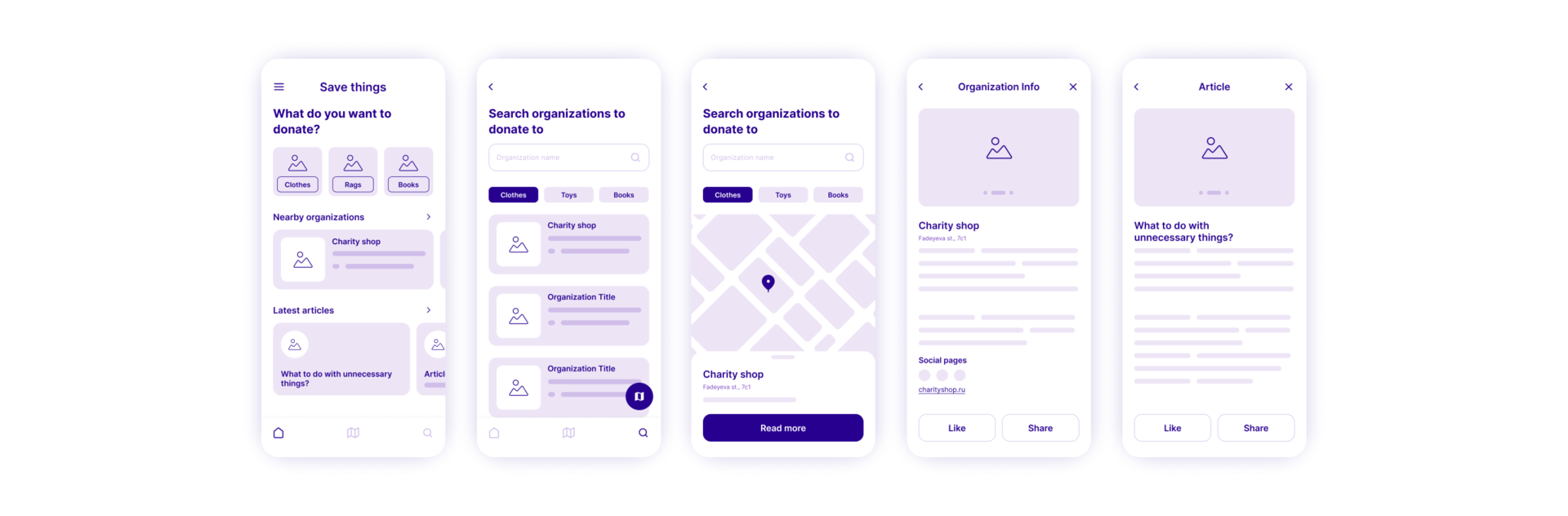
Digital wireframes
After drafting some paper wireframes, I created the initial designs for the Save things app. These designs focused on choosing a donation category and searching local organizations on the map.
Usability study
To prepare for testing, I created a low-fidelity prototype which you can view here. Findings from the first study helped guide the designs from wireframes to mockups. The second study used a high-fidelity prototype and revealed what aspects of the mockups needed refining.
View the Save things App high-fidelity prototype here.
View the Save things App high-fidelity prototype here.
The map is the heart of the app, as users primarily want to find nearby organizations
The map is important
The list of organizations should be integrated into the map so that users can easily choose organizations while staying on the same screen
Convenience
1
The information center should be accessible from anywhere in the app so that users always have the opportunity to read news and tips
2
Accessibility
3
Usability study findings
The map is the heart of the app, as users primarily want to find nearby organizations
The map is important
The list of organizations should be integrated into the map so that users can easily choose organizations while staying on the same screen
Convenience
1
2
The information center should be accessible from anywhere in the app so that users always have the opportunity to read news and tips
Accessibility
3
Usability study findings
The final design
Homepage and profile
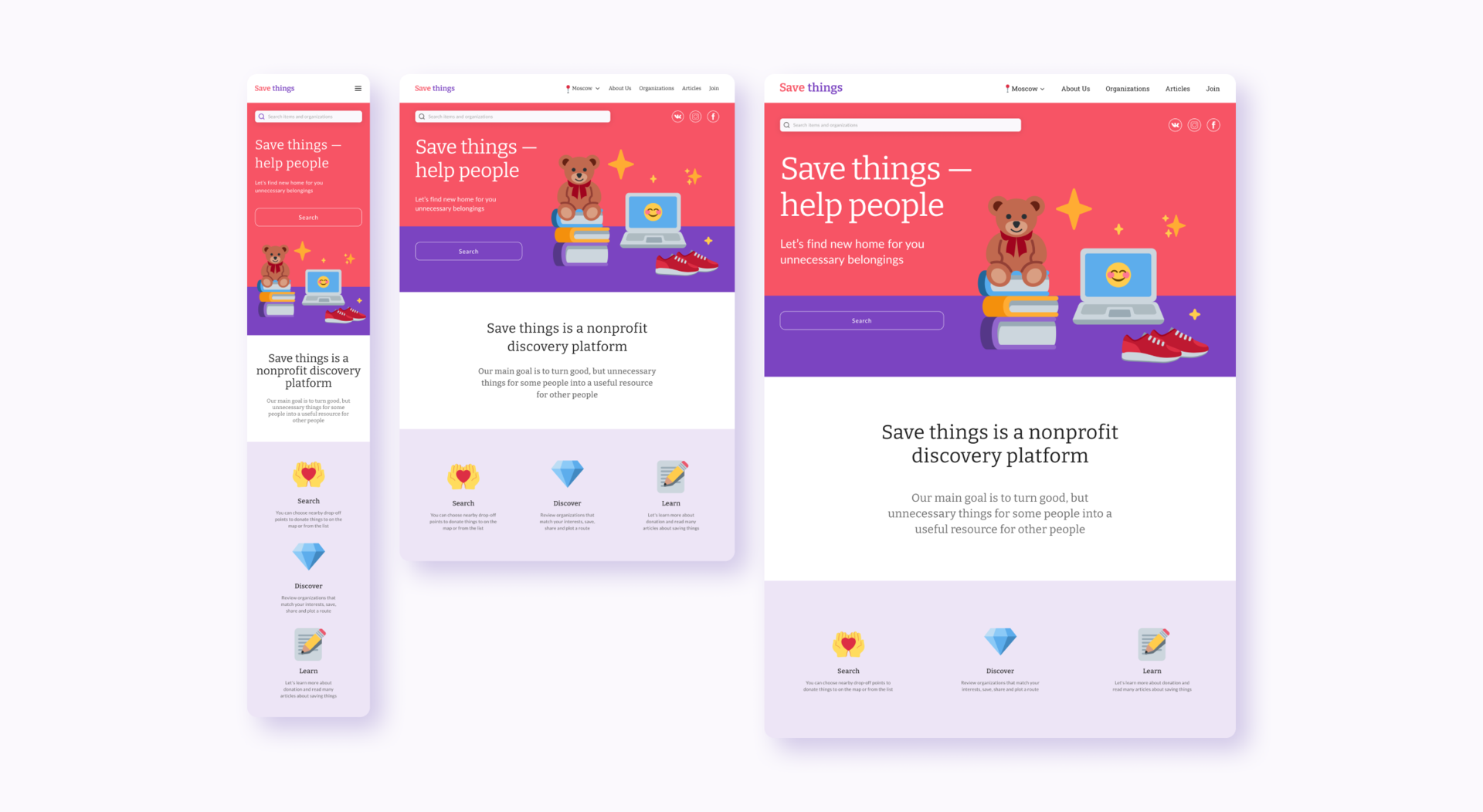
After choosing a location, the users are taken to the homepage, which invites them to review local organizations on a map or by using a catalog, and also allows them to read the latest articles. Interesting organizations and articles can be saved to favorites, access to which is in the user's profile.

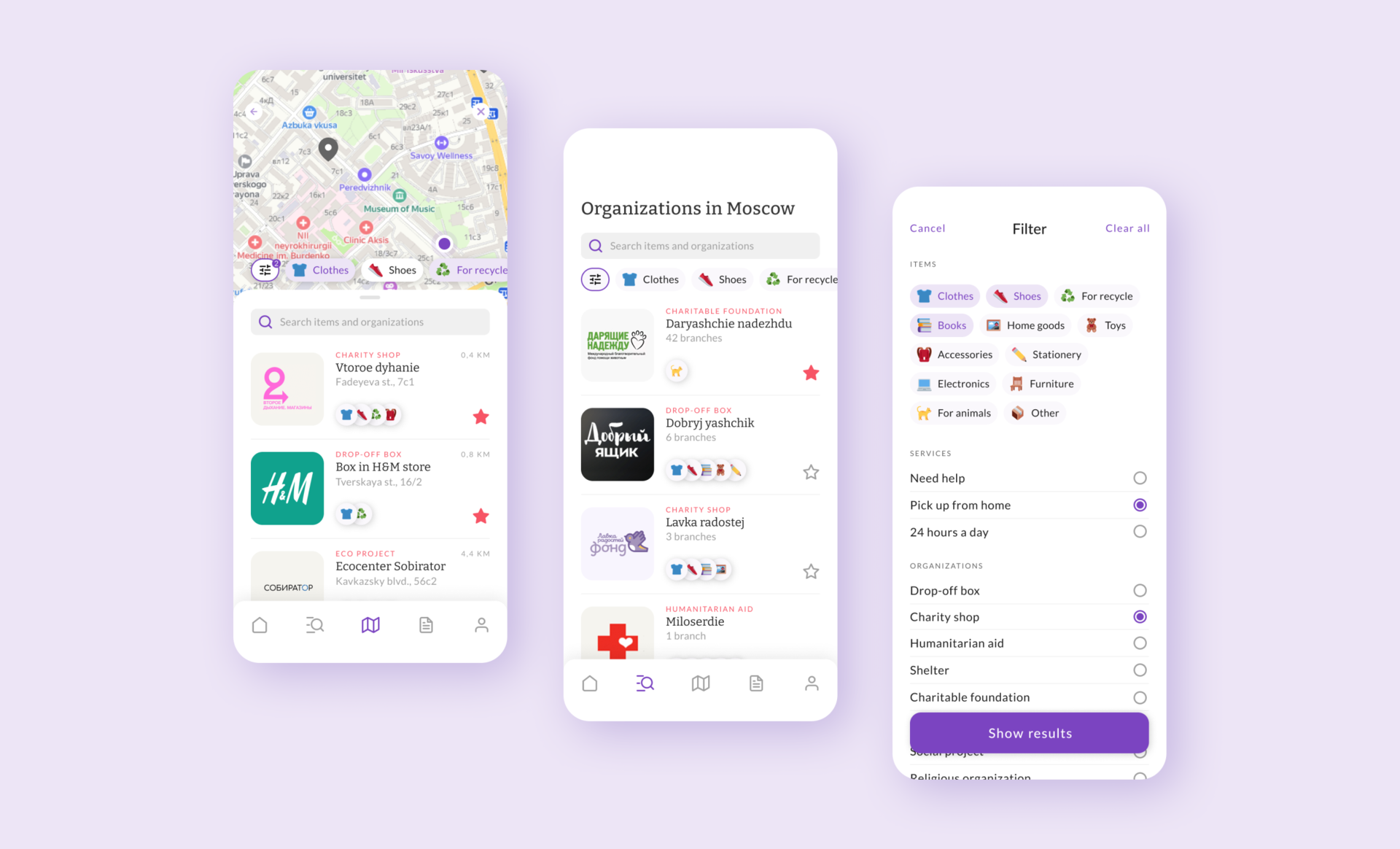
Search
The map will allow users to easily find nearby drop-off points, filtering points by using the donation categories or using additional filters or the search bar. If users wants to browse all organizations in the city that collect things for charity or recycling, they can switch to the catalog, where a filter is also available.
Discover
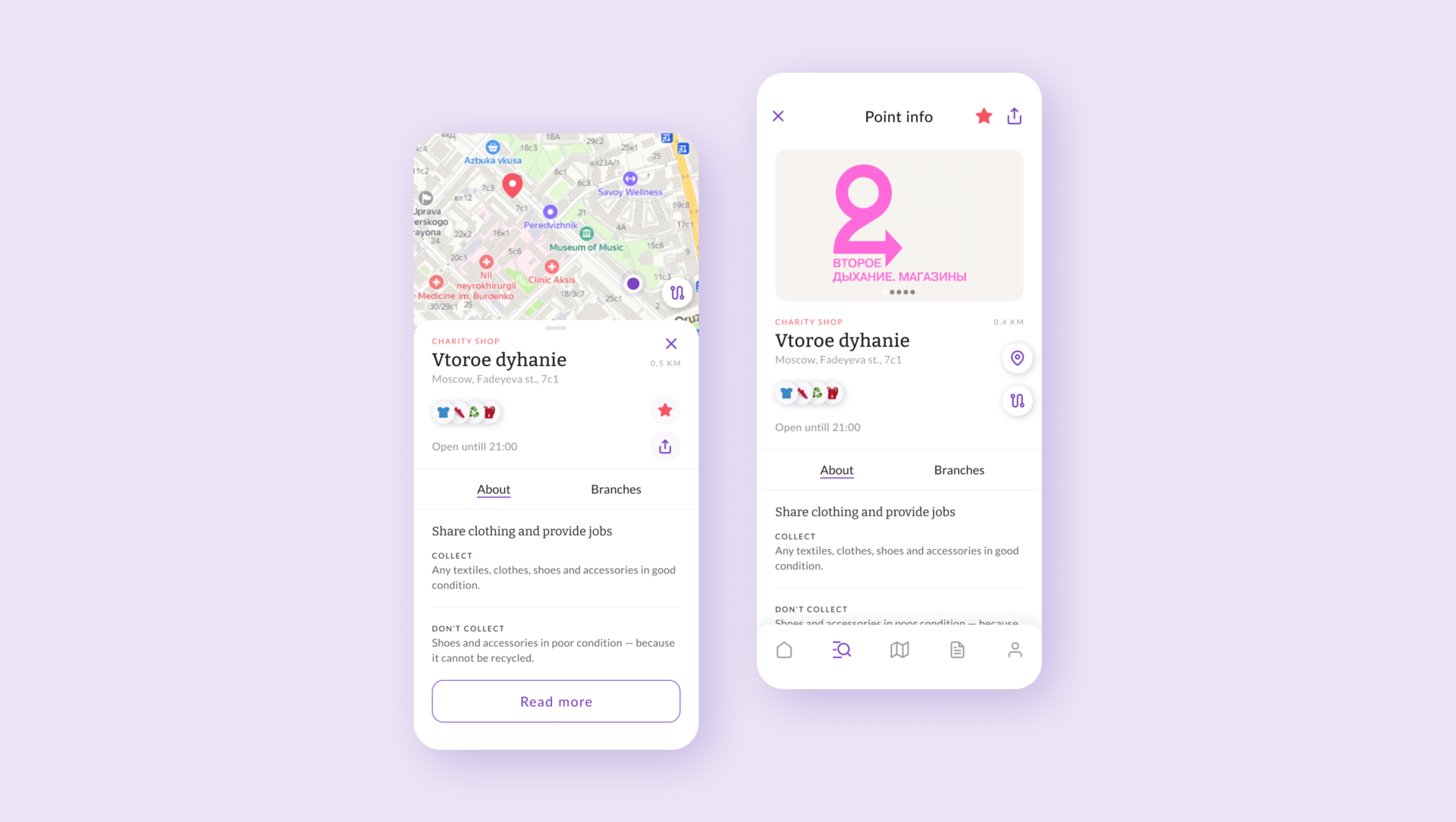
After choosing organization on the map or from the list, the users can explore them by opening the card and review more detailed information. Any organization can be added to favorites, shared or ploted the route.
Learn
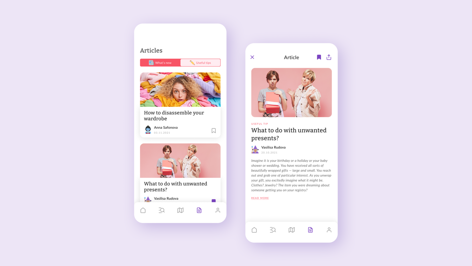
Since Save things not only helps to find organizations, but also performs a informative function, the users can access to the information center. It contains news from local organizations and announcements about things collection, as well as useful tips to help turn unnecessary things into a valuable resource for solving social and environmental causes.
And more

Responsive designs
With the app designs completed, I started work on designing the responsive website. The designs for screen size variation included mobile, tablet, and desktop. I optimized the designs to fit specific user needs of each device and screen size.
Style guide
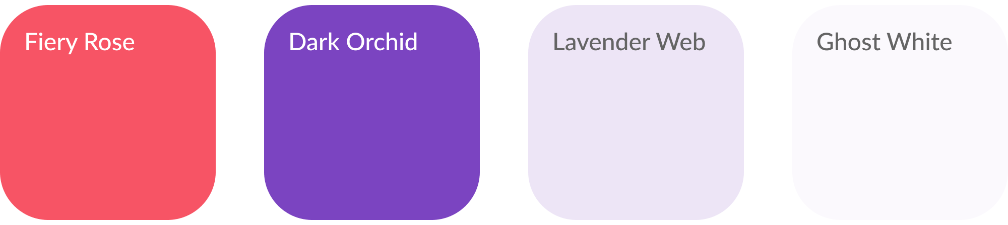
Using matching playful tones of color with calm and relaxing white, I was able to sell the identity of Save things as a playful, laid-back, intuitive application. I utilizated color sparingly throughout the app to convey which elements were interactable and should be paid attention to within the product. I also opted to use icons (except for the navigation) represent emoji from the Twitter collection (twemoji) within the interface as they played the pivotal role of matching the laid-back and universally understandable environment I had built in Save things interface.
Logotype
Typography
Headings

Body

Color palette
iOS app icon
A new era in the life of unnecessary things
Takeways
- Created the first service in Russia that combines social and environmental projects
- Designed a user friendly interface that quickly connects those who don’t know where to give away their unnecessary belongings and organizations collecting things for charity or recycling, allowing users to search for organizations based on their interests
- Created an information center that can be scaled to a social network for those who want to learn more about charity and responsible consumption